
5/3/2016, "Here’s Everyone Who’s Immigrated to the U.S. Since 1820," Metrocosm.com

"From 1820 to 2013, 79 million people obtained lawful permanent resident status in the United States. The interactive map below visualizes all of them based on their prior country of residence. The brightness of a country corresponds to its total migration to the U.S. at the given time. Use the controls at the bottom to stop / resume the animation or to move back and forth in time.
Two Centuries of U.S. Immigration (1 dot = 10,000 people)"
"Below, "Here are the largest immigration “waves” charted over time, showing the progression."

"Credit: Immigration data: Department of Homeland Security’s Office of Immigration Statistics (download: full report, data in Excel format). The data used for the map is “persons obtaining lawful permanent resident status,” which does not include illegal immigration or, as pointed out by @artsyTrish, people brought to the U.S. as slaves (“forced immigration”). World borders: Natural Earth"
Author: "Max Galka: I am an NYC-based entrepreneur (my newest project: Blueshift). I'm fascinated by data visualization and the ways that data is transforming our understanding of the world. I spend a lot of time with my face buried in Excel, and when I find something interesting I write about it here and as a contributor for the Huffington Post (more about my background)."
----------------------------------------
Added:
11/17/2016, "Election Results in the Third Dimension," Metrocosm
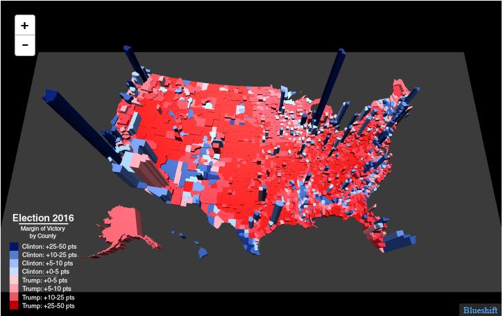
"County-level results from the 2016 U.S. presidential election
Color = winner and margin of victory
Height = total number of votes (all candidates)"
...........................
Comment: It appears the counties of Los Angeles and New York would decide the US president if there were no Electoral College.
...............
No comments:
Post a Comment