.
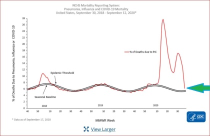
CDC Mortality Chart as of Sept. 17, 2020, Pneumonia, Influenza, and Covid-19
Above, CDC Mortality Chart as of Sept. 17, 2020 (scroll to end of page)
“Mortality Surveillance”
“The National Center for Health Statistics (NCHS) collects death certificate data from vital statistics offices for all deaths occurring in the United States. Based on death certificate data available on September 17, 2020, the percentage of deaths attributed to pneumonia, influenza, or COVID-19 (PIC) for week 37 is 6.2% and, while lower than the percentage during week 36 (9.3%) [this appears to be a typo, as prior week was 6.3, not 9.3] remains above the epidemic threshold. Percentages for recent weeks will likely increase as more death certificates are processed.
Weekly mortality surveillance data include a combination of machine coded and manually coded causes of death collected from death certificates. Percentages of deaths due to PIC [Pneumonia, Influenza, and Covid 19] are higher among manually coded records than more rapidly available machine coded records. Due to the additional time needed for manual coding, the initially reported PIC percentages may be lower than percentages calculated from final data.”
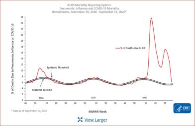
Below, same CDC chart as above, as of Sept. 17, without green arrow:
...........


No comments:
Post a Comment