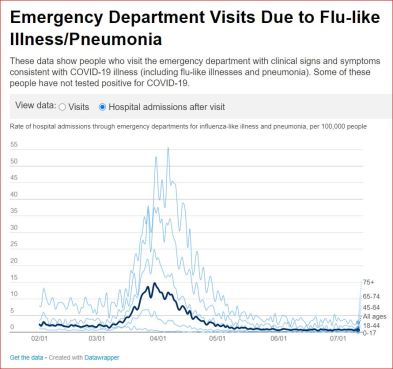
Near normal ER visits with respiratory complaints for over two months in NY City, early May to early July, 2020. Total chart dates: 2/1/20-7/13/20, five and a half months:
As of 7/13/20, “Emergency Department Visits Due to Flu-like Illness/Pneumonia,” nyc.gov
Chart below: Near normal ER visits for over two months, early May to mid July:
“These data show people who visit the emergency department with clinical signs and symptoms consistent with COVID-19 illness (including flu-like illnesses and pneumonia). Some of these people have not tested positive for COVID-19.”

Chart below, as of 7/13/20, Hospital admissions following “Emergency Department Visits Due to Flu-like Illness/Pneumonia,“ Total chart dates: 2/1/20-7/13/20, five and a half months:
Chart below: Near normal hospital admissions for over two months, early May to mid July, after visiting “emergency department with clinical signs and symptoms consistent with COVID-19 illness (including flu-like illnesses and pneumonia). Some of these people have not tested positive for COVID-19.”

…………………………………………..
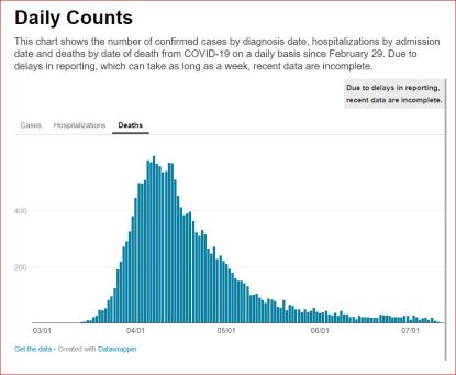
Added: NY City has had 8 consecutive weeks of very few Covid related deaths, mid-May to mid July 2020. On July 11, 2020, there were zero Covid deaths in NY City.
........

........
Above NYC.gov chart shows deaths as of July 13, 2020, “Daily Counts; This chart shows the number of confirmed cases by diagnosis date, hospitalizations by admission date and deaths by date of death from COVID-19 on a daily basis since February 29. Due to delays in reporting, which can take as long as a week, recent data are incomplete.”
………………………………………………
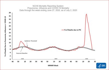
Added: CDC published national data show that as of July 3, Covid epidemic no longer exists in the US. Obviously, this means that no “pandemic” exists in the US either.
.....

....
July 3, 2020, “CovidView Weekly Summary,” cdc.gov
To see the above chart on CDC website, scroll to near end of page: “Mortality surveillance.”
Lower left of chart in 2018 when no epidemic existed is labeled “Epidemic Threshold.” Follow red line across to right side of chart to July 2020. The red line today is in the same place it was with no epidemic in 2018.
“The National Center for Health Statistics (NCHS) collects death certificate data from vital statistics offices for all deaths occurring in the United States. Based on death certificate data available on July 2, 2020, 5.9% of all deaths occurring during the week ending June 27, 2020 (week 26) were due to [one of three causes:] pneumonia, influenza or COVID-19 (PIC). This is the tenth consecutive week of a declining percentage of deaths due to PIC. The percentage is equal to the epidemic threshold of 5.9% for week 26.”
Meaning of “Epidemic threshold:“ Point when it’s not or is no longer an epidemic, as is clearly visible on above CDC chart. Per CDC chart, US has as much “epidemic” today as it did in 2018. At top of CDC page: “Key Updates for Week 26, ending June 27, 2020″...”Mortality attributed to COVID-19 decreased compared to last week and is currently at the epidemic threshold.”…
…………………………………………………
Added: Misuse of the word “cases” from Swiss Policy Research, July 2020:
Misuse and weaponization of the word “cases” grew with increase in “tests” in low-risk general populations. “Cases” in this context are often incorrectly “equated with sick or infected people.”… Swiss Policy Research, July 2020.…(See also: Suffolk County, NY State, removed 2105 positive tests from previous tally. Some tests didn’t differentiate “virus-killing antibodies that patients’ immune systems develop after becoming infected.".June 3, 2020, “New Suffolk virus tracking system leads to reduction of 2,105 positive tests,” Newsday, Matt Clark)
..........
No comments:
Post a Comment